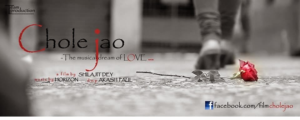
SOME TIPS OF MOVIE POSTER DESIGN
1.ATTENTION
If there’s one simple sales formula that everyone in a performance-based position should know, it’s AIDA. The four-step formula – attention, interest, desire, and action – has been used as the basis of thousands of successful movie advertising campaigns.
The first step, and the one most important for designers, is attention – grabbing the attention of passers-by and encouraging them to look.
This doesn’t have to be achieved with provocative pictures or flashy graphics, although given their advantage at grabbing attention, it’s no wonder Hollywood’s turned to them en masse.
By using the film’s characters or a major plot point, designers can establish some level of plot while still gaining the attention of anyone that views the poster.
ICONOGRAPHY--The most effective movie posters are iconic, presenting the themes in the film without resorting to flat out saying what it’s about.
They use imagery, whether a close-up of a character or item that’s a major plot point, or a simple graphic, to establish the film’s plot. Combined with an eye-grabbing design, this can be an incredibly effective way to gain attention and create interest at once.
INTERST--When using icons and more abstract imagery doesn’t work with your film – say, for example, it’s a serious drama or a thriller that can’t be explained with iconography – using an image that provides viewers with an idea of the story is a great idea.
Many of the best modern film posters use pictures that put the viewer in the middle of a scene from the film, creating tension and a major incentive.
The incentive is that in order to resolve the situation, the person looking at the poster needs to see the film and find out what happens
APPEALWith film studios cranking out comic book adaptations at a rapid pace, it’s the ‘true fans’ that end up last in the marketing line.
Studios can rely on them to see their new releases regardless of its review coverage or promotional materials, since chances are fairly strong they’re already aware of it. Great film posters, particularly those for adaptations, use this dual appeal to enhance their advertising
STYLE--Whether you’re marketing an art film or a blockbuster, style matters. Some of the most memorable film posters out there have used bold, unique artistic styles to their advantage.
What separates these posters from their ineffective art-for-art’s-sake rivals is that they’re consistent with style, in both the movie’s promotional materials and throughout the film itself.
LASTING APPEAL--Here’s the danger in getting too ‘arty’ and delicate with your film poster: it’s eventually, after release and theater shows, going to be shrunk to a fraction of its original size for the DVD release.
While a growing number of films now use different designs for their DVD cover than their in-theater promo posters, most of the classics and high-budget blockbusters still use the same poster for both.
RECOGNIZABILITY-- From time to time, the entire box office seems to be made up of sequels.
There’s a good reason for it too – some of the most financially dependable films are sequels to successful franchises.
From films that dominated both the commercial world and the awards scene to purely commercial releases, few films can guarantee studios income like a good sequel.
That’s why sequel posters tend to be highly related to the first release, generally with a giant title in the top third of the canvas and instantly recognizable imagery throughout it.


No comments:
Post a Comment